Party CSS
Why don’t you love me?
I love party parrots.
My boss regrettably does not.
I’m a big believer in exposure therapy, so I made this project to torment immerse him in party parrots with the hope that he would come around to liking them.
The ultimate form of exposure therapy was to turn the frontend of the project I work on into a partified wonderland.
Unfortunately it didn’t work and somehow he hates party parrots even more. 
Making a ‘party div’ is quite simple, I define a 🦜 css class which works all the magic.
It makes HTML elements bob in an oval and change rainbow colours. 
The implementation of 🦜 is very simple.
It’s fundamentally a composition of two animations; 🎉 and 🎨.
.🦜 {
  animation:
    🎉 var(--anim-time) infinite linear,
    🎨 var(--anim-time) infinite linear;
  transform-origin: bottom center;
}
The 🎨 animation is responsible for the colour.
It was created by sampling the original party parrot gif for each frame.
I created a simple one-shot script to grab the colours called extract-colours.py.
🎉 on the other hand is responsible for the motion.
The keyframes are calculated using basic trigonometry to make an oval motion by combining skew, translation, and scale.
The entire CSS definition for 🦜 is created by another cack-handed one-shot script party-css-gen.py, combines work generating both animation components for a seamless, partyparrotesque monstrosity.
It’s not perfect, but for that reason you have multiple parameters to tune the animation to your liking. The following parameters are available:
--max-translation: 0px; /* pixels */
--translation-phase: -3; /* radians */
--max-skew: 18; /* degrees */
--max-scale-diff: 0.15; /* scale factor */
--anim-freq: 2; /* Hz */
-
--max-translationis the maximum amount of horizontal translation the element will undergo in pixels. -
--translation-phaseallows you to phase shift the translation. It’s in radians, so 0 is no phase shift, pi is a half cycle shift, etc, relative to the skew. -
--max-skewis the maximum amount of skew the element will undergo in degrees. Skew is a bit weird as it is a transvection. It looks weird for large values. -
--max-scale-diffis the maximum difference in vertical scale the element will undergo. It’s a scale factor, so 0.1 is a +/-10% difference in scale. -
Finally,
--anim-freqis the frequency of the animation in Hz. The traditional party parrot gif is 2Hz, but you can change this to whatever you like.
Party or die!
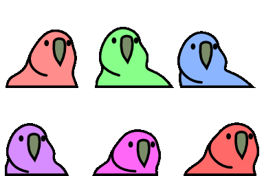
See it in action on jsfiddle or just visit the repository WillMatthews/party-css where you can find the CSS and the scripts used to generate it. On there I also provide a fancy bookmarklet which you can use to partify any webpage you like, wield this power recklessly.
A special thank you is owed to jmhobbs, the keeper of the parrots, for providing an excellent resource and for graciously adding the link to this project on the party parrot website. 
This post is signed by me
Cross-check this clearsigned file with my public key to verify the authenticity of this post.